

When it comes to showcasing artwork or photography, even the smallest shift in color can change the entire feel of a piece. That’s why choosing the right printing approach really matters. At Artistic Wholesale Printing & Framing, our focus is on helping creators and businesses get the best possible results, and that starts with understanding how different printing methods for color accuracy can impact the final print.
We’ll explore which printing techniques do the best job of preserving those delicate color shifts. The result is having the confidence that your final prints will accurately reflect the quality and vibrancy of your original work.
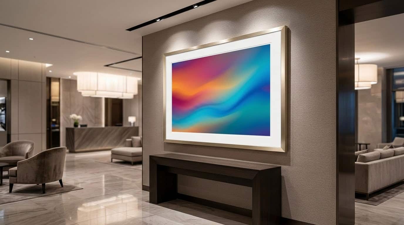
Table Of Contents
- Understanding why color gradients are difficult to preserve in print
- How different printing methods for color accuracy affect gradient quality
- Ensuring smooth, consistent results in your final printed piece
- How Artistic Wholesale Printing & Framing helps preserve color gradients
Why Smooth Color Gradients Are Hard to Reproduce in Print
A color gradient is just a smooth blend between two or more colors. Instead of one color stopping and another starting suddenly, the colors slowly mix together. For example, a sunset often looks like a gradient because the orange slowly fades into pink or purple.
Color gradients often look seamless on a screen, but getting the same smooth effect in print is much more complicated. Digital displays and printers work in different ways. Screens use light-based RGB color, which can produce millions of bright, glowing shades. Printers use ink-based CMYK (Cyan, Magenta, Yellow, and Black) color, which has a narrower range of colors but offers superior durability and texture for physical prints.
How the ink reacts on the paper is a significant challenge. Depending on the stock used, ink can absorb unevenly, slightly shifting tones and making subtle transitions harder to maintain. Even subtle differences in paper calibration can cause “banding” where a gradient that should look smooth ends up showing faint steps between colors.
Best Printing Methods For Color Accuracy
Achieving perfect color consistency depends on selecting the right technology for your specific medium. Whether you prioritize archival depth or high-volume precision, understanding these methods ensures your gradients remain smooth and professional.
Giclée Printing for Fine Art Detail
Giclée printing is one of the most trusted methods for artwork reproduction. Think of it as specialized printing that far exceeds what standard ones could do. It’s excellent for fine art reproductions or museum-quality photographic prints, offering exceptional color depth and longevity.
Digital Printing for Everyday Art Prints
Quality digital printing is good for prints that need to be produced at a high scale or quickly. It’s good for general artwork that might be needed, such as restaurants or corporate offices.
High-End Inkjet Printing for Color Accuracy
Modern high-end inkjet printing uses advanced technology to carefully control how ink is placed on paper. This helps reduce color shifts and keeps artwork closer to the original file.
Keeping Artwork Prints Smooth and Consistent
Even when the right printing method is chosen, there are still a few extra things that can affect how smooth and consistent your final artwork looks. Printer calibration involves fine-tuning the machine to get steady output with consistent colors. Without regular calibration, colors can slowly shift over time, which can affect gradients and overall consistency.
The type of paper or surface used also affects the final result. Typically, smoother surfaces can help gradients look cleaner. Texture surfaces make transitions look a bit softer or uneven. You should also pay attention to how prints look in different lighting. They can appear to change hue or intensity depending on whether they are viewed under different lighting (cool, natural, or warm). The table below helps you understand this more clearly.
| Factor | Description | Impact |
| Printer calibration | Adjusting the printer for accurate color output | Helps keep colors stable and predictable |
| Paper type | The surface you print on (smooth, textured, coated, etc.) | Changes how sharp or soft colors and gradients look |
| Ink absorption | How much ink the paper soaks in | Can make colors look darker or lighter |
| Lighting conditions | The light you view the print under | Can make colors look different than expected |
How Artistic Wholesale Printing & Framing Keeps Colors Gradients Accurate
Preserving smooth color gradients is a key part of producing high-quality artwork prints. Weuse advanced large-format and fine art printing equipment designed to handle detailed artwork reproduction with strong color consistency.
Printing methods for color accuracy also matter when you offer different print surfaces. Each surface (metal, canvas, premium paper) interacts with ink differently, and their team helps guide those choices. Since we specialize in the printing and framing process at once place, we can control the process from start to finish. This helps reduce inconsistencies that can sometimes happen when artwork is handled by multiple providers, giving artists and customers more reliable results
Ready to Start Your Custom Print and Frame Project?
Are you looking for high-quality results that keep your artwork looking sharp and color-accurate? Artistic Wholesale Printing & Framing is a great place to begin. Our team specializes in professional printing and custom framing solutions designed to handle everything from fine art to large-format pieces. We are located in the Salt Lake City Utah, area, but ship across the country. Learn more about our services today.