Category Archives: Blog

Top 10 Things to Consider While Choosing the Mat Board

One of the most underappreciated aspects of keeping your artwork pristine is the mat board you select. It can completely transform how your artwork looks in a frame. From enhancing colors to protecting your art, the mat board plays a key role in style and preservation.  Keep these considerations in mind when you’re choosing your next mat board for long-lasting beauty and protection.

mat board thicknessWhat Is A Mat Board?

Mat boards are sometimes referred to as “mounting boards,” but they are acid-free paper-based materials used in picture framing. It has two primary functions. First, it provides a visually appealing border that naturally draws the eyes to your artwork. Secondly, it’s a protective space between the glass and the artwork to prevent moisture and sticking.

1. Mat Board Thickness

Mat board thickness is at the top of your considerations because it is crucial for artwork preservation and visual appeal. Thinner mats give a sleek, minimal look, perfect for modern frames. If you’re double matting, combining a thicker outer mat with a thinner inner mat adds dimension and contrast.

2. Color Coordination

Mat colors can have a direct impact on how your artwork is perceived. Complementary colors can make the artwork itself more appealing, while a neutral mat keeps the focus on the piece itself. Testing a few color options against your artwork can help you find the perfect match.

3. Texture Matters

Mat textures come in different styles that reflect the type of artwork you’re displaying. For example, linen-finished mats can work best for watercolor paintings. Conversely, stark white mats are preferred for photography or highly detailed pen and ink drawings. The right texture enhances the piece around it, not distracts.

4. Single Vs. Double Mat

Single mats are good for a clean and straightforward look, while double mats use layers to create greater depth and a more sophisticated look. Use a single mat for simplicity and modern aesthetics, and a double mat when the artwork is complex or needs extra visual separation from the frame.

5. Archival Quality

It’s important for people to have their artwork last a long time. Choosing a mat board that is acid-free and has good archival quality (meaning it will not yellow or degrade over time). This is essential for preserving the integrity of your art and preventing damage from acid migration. Increasing mat board thickness also matters because it helps keep the artwork from touching the glass, which is essential for preservation.

6. Size Proportion

The mat’s width matters because it should complement the size of your artwork. Smaller pieces often look better with slightly wider mats to give them presence on the wall. Larger works may need narrower mats so the frame and artwork stay in proportion and complement the size of your artwork.

7.  Frame Compatibility

The picture frame style and depth can determine the mat board choice. Deep, ornate frames can handle a thicker, textured mat. Sleek or shallow frames work best for a smoother board. Make sure the mat board fits well inside the frame’s rabbet without bulging. The result must be a cohesive finished presentation.

8. Highlighting Key Elements

A well-chosen mat can draw attention to specific parts of your artwork. For instance, a colored inner mat in a double-mat setup can emphasize details or subtle color. Or, a contrasting mat board thickness will enhance the visual weight of the art.

9. Ease Of Maintenance

Mats that are easy to clean and resist dust buildup simplify the long-term care of your framed piece. Look for boards with protective coatings or smooth surfaces that can be gently wiped clean. This minimizes the need for frequent dismantling of the frame.

10. Sourcing Quality Materials

One of the most important considerations when selecting the right mat board is finding a reputable source for framing supplies. For those in the Salt Lake City area, Artistic Wholesale Printing & Framing offers thousands of mat boards, frames, and much more to keep your project professional.

Bringing It All Together

Choosing the right mat board isn’t only about color or thickness. It goes much further than that. The tips above ensure your piece will be beautifully displayed, whether it’s a personal photo, a professional print, or a treasured painting. Don’t settle for anything less than perfection when it comes to displaying your artwork. Explore online to learn more about our printing and framing services. At Artistic Wholesale Printing & Framing, we are conveniently located in the Salt Lake County area. We proudly service the local community with superior picture framing supplies for clients who put their trust in us.  Explore more about our picture framing services in Utah today!

How to Plan a Gallery Wall: Spacing, Layouts, and Hanging Tips

Creating a gallery wall can transform a dull and lifeless space into a personal art display that reflects your style. If you’ve ever stared at a blank wall wondering how to arrange your frames without making it look chaotic, you’re not alone. Planning a gallery wall layout takes a bit of strategy. There are factors to consider, like spacing, leveling, and finding that right amount of balance. Below is everything you need to know to create a visually stunning display.

gallery wall layout

Grid vs. Salon Layouts: Choosing Your Style

The two most popular gallery wall layouts are grid and salon styles. Consider the differences below to choose the layout that best suits your space and art collection.

  • Grid Layout- This can be a top consideration if you’re going for a modern, polished look. Frames are arranged in straight rows and columns, often with equal spacing between each piece. This is also a great option if your frames are about the same size and style. Think of having “order” in a room, which is good for offices, living rooms, or even some commercial spaces.
  • Salon Layout: This layout is considered more artistic or eclectic. Here, frames of different sizes or orientations are closely hung together to reflect a dynamic, layered look. Salon layouts give you freedom to mix colors, textures, and frame styles. It’s ideal for home galleries, hallways, or creative spaces where you want personality to shine.

Tips for Spacing, Leveling, and Visual Balance

Once you’ve picked the gallery wall layout, you’ll be making sure everything looks balanced. Here are some expert tips.

Spacing

It’s important to space frames equally apart from each other to avoid a “cluttered” look.  A general rule of thumb is 2–4 inches between each frame, but this can vary depending on wall size and frame dimensions.

Leveling

Use a level or laser guide to ensure your frames are straight. Even the smallest misalignment can ruin the symmetry of a grid layout or make the salon layout appear haphazard.

Visual Balance

Avoid placing all the heavy or larger pieces on one side and distribute the weight evenly across the wall instead. Balance can also be achieved by distributing colors and different shapes. Try to create a triangle or circular visual flow to guide the eye naturally across the wall.

Pro tip: Place the largest or heaviest pieces first, and then fill in with smaller pieces to maintain a balanced composition.

Layout Templates and Reference Guides

It’s understandable to be nervous about hanging frames, and layout templates can be a lifesaver more than you realize. Many online guides and printable templates help you plan your gallery wall layout before you start hammering nails. Here’s a simple approach:

  1. Paper templates: Trace each frame on craft paper and tape the shapes to the wall. Why is this important? It gives you a visual reference without committing to holes in the wall.
  2. Digital Layout Tools: Online grid planners and augmented reality apps can give you a unique preview of your space using actual photos to envision the real version.
  3. Symmetry Grids: Measure and mark equal intervals on the wall to ensure uniform spacing for symmetry grids.
  4. Salon Mockups: Use the floor or a large table to arrange your pieces into a pleasing composition before transferring the plan to the wall.

The bottom line is that templates and reference guides save your time, stress, and costly mistakes. The gallery wall layout looks much more professional and polished with intentionality and careful planning.

Local Touch: Artistic Wholesale Printing & Framing

If you’re in the Salt Lake City area or nearby, Artistic Wholesale Printing & Framing is your trusted expert for high-quality framing supplies and printing services. We have more than 25 years of experience in the business, providing thousands of mouldings, mat boards, and custom printing options. Whether you’re looking for unique frames, matting options, or professional-grade prints, we have the expertise and inventory to help your wall shine.

Our team also provides picture hanging services throughout Utah. The process is far more complex than most people realize. We can transform a dull room into something you’ll love. Our hanging services are stress-free, and the result is a perfectly installed gallery wall that enhances your space. We strive to make the interior design process one you’ll come to love.

Gallery Wall Layout: Final Tips and Professional Hanging

When it comes to the final setup, remember that patience pays off. Take your time to arrange and adjust frames until the composition feels right. Use the spacing and balance tips we covered, and don’t be afraid to step back and view the wall from different angles. For those in the Salt Lake City area, partnering with a trusted local expert like Artistic Wholesale Printing & Framing can make the process seamless from start to finish.

Art Placement Mistakes That Ruin the Room — and How to Avoid Them

You can spend hours choosing the perfect painting, photograph, or print—but if it’s hung wrong, the entire room can feel “off.” At Artistic Wholesale Printing & Framing in West Midvale, we’ve seen beautiful pieces lose impact simply because they were placed too high, too low, or under poor lighting. The good news? These problems are easy to fix with the right eye for proportion—and the help of a professional picture hanging service.

Whether you’re styling a cozy bedroom, a long hallway, or a sleek office lobby, placement is just as important as the art itself. Here’s how to avoid the most common mistakes and make your walls look like a pro styled them.

hanging serviceMistake 1: Hanging Art Too High or Too Low

This is one of the most common—and most overlooked—decorating errors. Many people instinctively hang art at the wrong height, especially when working around furniture or trying to fill wall space.

As a rule of thumb, artwork should hang so that the center of the piece is about 57 inches from the floor, roughly eye level for the average person. Hanging art higher can make it feel disconnected from the room, while hanging it too low creates an imbalance.

If you’re displaying a grouping or gallery wall, treat the entire collection as one large piece and keep the midpoint at the same height.

Mistake 2: Choosing the Wrong Size

Proportion is everything. A small picture on a vast wall looks lost, while an oversized frame can overwhelm a compact space. To find the right fit, aim for a balance between the art and the surrounding furniture.

  • Above a Sofa or Bed: The art (or grouping) should be about two-thirds the width of the furniture beneath it, with 6–8 inches between the top of the furniture and the frame’s bottom.
  • Over a Console or Fireplace: Fill the width without crowding the edges. If one piece feels too small, try two or three coordinated works.
  • Standalone Walls: When there’s no furniture, go larger. It helps anchor the space and prevents the art from looking like an afterthought.

When you work with a professional hanging service, they’ll measure walls and furniture precisely to ensure perfect balance from every viewing angle.

Mistake 3: Ignoring Lighting

Even the most stunning artwork loses vibrancy under harsh or uneven lighting. Natural light shifts throughout the day, and artificial light can cast shadows or glare.

Keep these lighting principles in mind:

  • Avoid direct sunlight, which can fade prints and paintings over time.
  • Use spotlights or track lighting to highlight key pieces.
  • Add dimmers to adjust brightness and mood.
  • Check for glare at different times of day, especially with glass-front frames.

Professional installers often consider lighting as part of a complete design plan. At Artistic Wholesale, our experts help position artwork so that placement and illumination work together beautifully.

Mistake 4: Skipping Wall and Room Context

Every room tells a story, and art should complement—not compete with—it. The same piece can feel completely different depending on the wall color, ceiling height, and flooring tone.

  • Lobbies or Offices: Large, open areas benefit from bold statement pieces. Bigger canvases or grouped prints fill vertical space and create a focal point. Symmetry often works well, but avoid crowding walls near entrances or seating.
  • Bedrooms: Soft tones and cohesive arrangements create calm. The art above the headboard should be wide enough to anchor the bed but not so tall that it competes with lighting or décor.
  • Corridors or Hallways: Long, narrow spaces come alive with series or linear arrangements. Keep pieces eye-level and evenly spaced. In dim hallways, accent lighting adds depth and dimension.

Each space benefits from precise measuring, planning, and alignment—something a professional picture hanging service can effortlessly handle.

Mistake 5: Failing to Plan the Layout

Even seasoned decorators sometimes skip the planning stage, hanging one piece at a time and hoping for the best. A cohesive arrangement takes foresight.

Before picking up a hammer, lay your art on the floor and arrange it until it feels balanced. Snap a photo of the layout, measure spacing, and then transfer it to the wall. This extra step saves time, prevents patchwork fixes, and ensures the final display looks intentional.

Our picture hanging professionals use specialized tools—laser levels, spacing guides, and secure hardware—to deliver flawless results from every angle.

Why Scale and Symmetry Matter

When you enter a well-designed room, everything feels harmonious—even if you can’t explain why. That’s the result of thoughtful scale and proportion. Large art balances expansive furniture, while smaller pieces punctuate nooks or stairway landings.

Symmetry adds visual stability. Two smaller works flanking a mirror or one large canvas centered above a mantel create rhythm and cohesion.

At Artistic Wholesale Printing & Framing, we approach every installation with this design logic. Our picture hanging team draws on nearly three decades of experience to achieve museum-quality results in your home or office.

Mistake 6: Treating Hanging as a DIY Project

While hanging a picture might seem simple, precision requires more than a hammer and a few nails. Wall type, weight, and frame material all matter. A misstep could damage both the wall and the artwork.

With Artistic Wholesale’s professional hanging service, you can skip the stress and guesswork. We handle measuring, alignment, and safety checks so you can focus on enjoying the finished look. Whether you’re decorating a home, office, or gallery, we ensure each piece looks exactly as it should—secure, level, and perfectly placed.

Elevate Your Space with Trusted Picture Hanging Services

Only when displayed correctly can artwork enhance a room’s personality. Proper height, proportion, and lighting add polish that DIY methods rarely match.

If you’re ready to elevate your space, let the experienced Artistic Wholesale Printing & Framing team handle the details. With our expert picture hanging service, you’ll get seamless results that highlight your artwork and transform your walls into a cohesive, inviting display. Contact us today!

Top Best Materials for Indoor vs. Outdoor Graphics: A Breakdown

Not all signs are created equal. The materials behind your graphics determine their lifespan, vibrancy, and overall performance. At Artistic Wholesale Printing & Framing, we help Utah businesses choose the right solution for every space—from polished indoor and outdoor graphics to large-format displays that stand out. Understanding the strengths of each material helps ensure your signage looks professional, lasts longer, and makes a lasting impression.

indoor and outdoor graphic materialsVinyl: The Versatile Standard

Vinyl is the workhorse of indoor and outdoor graphics. It’s flexible, durable, and suitable for nearly any surface—walls, windows, floors, or vehicles. For indoor applications, vinyl’s clean finish and smooth texture give a professional look to wall wraps, window lettering, and point-of-purchase displays. Outdoors, it’s ideal for banners and building wraps exposed to the elements.

The secret lies in the adhesive and laminate finish. Indoor vinyl uses lighter adhesives for easy removal without wall damage, while outdoor vinyl relies on stronger bonding agents and UV-resistant coatings. High-quality cast vinyl can last up to seven years outside without fading or peeling.

Best for: Window graphics, event banners, wall wraps, and seasonal promotions.
Why it works: Cost-effective, vivid color reproduction, and strong adhesion.

Acrylic: Sleek and Sophisticated

Acrylic signage offers a modern, high-gloss finish ideal for corporate interiors, retail displays, and hospitality environments. Its glass-like clarity adds depth and visual brightness while remaining lighter and more durable than glass.

Indoors, acrylic panels are perfect for branded wall art, directional signage, and logo displays that need a polished, high-end appearance. Outdoors, thicker acrylic sheets combined with UV-cured inks resist fading and cracking.

One of acrylic’s biggest advantages is its color longevity. It holds pigment exceptionally well, keeping graphics bright and saturated under intense lighting.

Best for: Lobby signs, backlit displays, and storefront branding.
Why it works: Premium aesthetic, excellent light diffusion, and fade resistance.

Aluminum: Built for the Elements

When durability takes top priority, aluminum is unmatched. It’s weather-resistant, rust-proof, and ideal for permanent outdoor graphics that must withstand Utah’s sun, snow, and shifting temperatures.

For outdoor business signage, aluminum panels with UV-stable inks and protective coatings maintain color and finish for years, outlasting wood or plastic alternatives. Indoors, brushed aluminum adds a sleek industrial look that suits modern offices, galleries, and showrooms.

Many commercial properties use aluminum composite material (ACM)—two thin aluminum sheets bonded to a polyethylene core—for extra rigidity without excess weight.

Best for: Long-term building signs, job-site signage, and trail or directional markers.
Why it works: Unbeatable weather resistance and professional presentation.

Fabric: Soft, Lightweight, and Dynamic

Fabric has become a favorite for trade shows, interior décor, and retail installations because it offers flexibility and warmth. Unlike rigid materials, fabric graphics can be stretched, folded, or transported without permanent creasing.

Indoor fabric prints—often made from polyester or canvas blends—provide a refined, upscale look for backdrops, wall décor, or soft signage. They’re lightweight, easy to replace, and offer minimal glare under lighting.

Specially coated fabrics treated for UV protection and water resistance perform surprisingly well outdoors for temporary banners or event tents. Artistic Wholesale’s advanced HP Latex printing process ensures color saturation stays even across fabric textures, delivering crisp, true-to-life visuals.

Best for: Trade show backdrops, seasonal retail graphics, and wall décor.
Why it works: Lightweight, portable, and rich in texture.

Weather Resistance and Color Longevity

The primary difference between indoor and outdoor applications lies in exposure. Wind, moisture, sunlight, and temperature swings are relentless on outdoor materials. Every project should consider weather resistance and color longevity early in the design phase.

  • Vinyl and aluminum provide superior resilience for outdoor environments, resisting fading and cracking.
  • Acrylic and fabric thrive indoors, maintaining vibrant color and surface quality in controlled climates.
  • Protective coatings and UV-cured inks extend the lifespan of both interior and exterior prints.

At Artistic Wholesale, we print using eco-friendly, water-based latex inks that are odorless, fast-drying, and naturally resistant to scratching and smudging. The result is color that stays bold and consistent over time, no matter where your signage is placed.

Matching Material to Application

Selecting materials is about matching function to message.

  • Retail and Restaurant Interiors: Acrylic or fabric signage enhances décor without overpowering it.
  • Corporate or Lobby Spaces: Brushed aluminum or acrylic panels convey professionalism and permanence.
  • Trade Shows and Events: Fabric or lightweight vinyl is easy to transport, assemble, and store.
  • Outdoor Promotions: Heavy-duty vinyl or aluminum ensures signs remain vibrant through rain, snow, and heat.

Our design team at Artistic Wholesale helps clients pair the right materials with the right message, ensuring every sign delivers maximum visibility and longevity.

Why Material Choice Matters for Branding

Think of your signage as a silent ambassador for your business. Every texture, color, and finish communicates quality. A sleek acrylic logo display conveys modern precision, while a durable aluminum sign demonstrates reliability.

High-quality indoor and outdoor graphics unify every touchpoint—from storefronts to trade shows. When materials fail or colors fade, that unity breaks, affecting customer perception.

Investing in the right materials from the start protects your image and budget.

Bringing Your Graphics to Life

From eye-catching vinyl banners to durable aluminum displays, Artistic Wholesale Printing & Framing combines technology, craftsmanship, and design expertise to produce graphics that last. Our HP Latex printer allows us to say “yes” to almost any substrate, delivering bold, environmentally friendly results on time and within budget.

Whether you need vibrant trade show backdrops or permanent exterior signage, we’ll help you choose the ideal materials for stunning indoor and outdoor graphics that capture attention and elevate your brand. Contact our Utah team today to discuss your custom graphics.

Choosing the Right Graphic Print Finish: Matte, Gloss, or Satin for Large Graphics

When creating large-format prints that genuinely stand out, the finish you select is more than a design choice—it’s a performance factor. A graphic print finish doesn’t just influence how colors appear; it also determines how your display responds to lighting, resists wear, and maintains visibility over time. At Artistic Wholesale Printing & Framing in Midvale, Utah, we help businesses evaluate the pros and cons of matte, gloss, and satin finishes so their indoor and outdoor graphics deliver consistent results and lasting impact.

custom design artistic wallpaper aesthetic murray

canvas wallpaper, crack resistant, format for any size wall. custom printed design wallpaper for business, personal, home, decor

Understanding the Finish Options

Gloss Finish – Gloss provides maximum vibrancy. Colors appear bold and saturated, with strong contrast that makes designs “pop.” Gloss is also easier to clean, which is helpful in high-traffic environments. The trade-off? Under bright or uneven lighting, the reflective surface can create glare that distracts from the message.

Matte Finish – Matte diffuses light instead of reflecting it. This makes graphics and text easier to read under direct sunlight, spotlights, or mixed lighting. It’s especially effective where glare control matters. The cost of that control is slightly softer color saturation—but many businesses value the elegant, professional look.

Satin Finish – Satin, sometimes called semi-gloss or luster, strikes a middle ground. It retains some of the vibrancy of gloss while avoiding its harsher reflections. Versatile and balanced, satin is often chosen when both readability and depth of color are essential.

Pros and Cons Based on Lighting and Reflection

  • Gloss excels in controlled lighting environments with indirect illumination, such as retail stores. However, it can be problematic in window-facing displays or beneath harsh overhead lights, where reflections obscure details.
  • Matte ensures readability in virtually any lighting condition. It prevents glare “hotspots” and creates a uniform appearance across angles. Its subdued palette often enhances professionalism.
  • Satin provides a measured compromise—retaining visual depth while reducing distracting reflections. It’s a dependable choice for mixed-use spaces.

How Placement Shapes Your Graphic Print Finish

The environment plays a critical role in determining the right finish:

  • Indoor Graphics – Lobby displays, trade show booths, and hallways benefit from gloss when lighting is predictable and maximum impact is desired. Matte is preferable in offices or brightly lit retail spaces where legibility is the priority. Satin adapts well when lighting shifts throughout the day.
  • Window-Facing Graphics – Direct sun and reflective glass make gloss a challenge. Matte or satin finishes prevent mirror-like reflections that reduce visibility in these cases. Satin provides some vibrancy without sacrificing clarity.
  • Outdoor Graphics – Exterior signage is constantly exposed to the elements. Matte maintains readability in sunlight, while satin adds vibrancy without excessive glare. Gloss can work outdoors if paired with protective lamination, but it generally requires more upkeep to prevent reflections from undermining visibility.

Pairing Your Finish with Lamination

A finish alone cannot guarantee durability—lamination is essential for extending the life of graphic print finishes used in indoor and outdoor graphics. It protects against scratches, UV exposure, and moisture while reinforcing the look of the chosen finish.

  • Gloss Laminate – Increases shine and enhances color depth, though it may exaggerate reflections. Best for indoor settings with stable lighting.
  • Matte Laminate – Reduces glare even further while adding toughness. Excellent for outdoor signage, window graphics, and frequently touched displays.
  • Satin Laminate – Offers a balance of protection and vibrancy, keeping graphics eye-catching without the drawbacks of high-gloss glare.

From trade show banners to long-term outdoor wraps, lamination is the step that safeguards your investment.

Choosing the Right Graphic Print Finish

When selecting between matte, gloss, and satin, consider:

  • Lighting conditions: Bright or uneven light favors matte or satin; controlled light can accommodate gloss.
  • Placement: Indoor promotions thrive with gloss, while outdoor signage benefits from matte or satin.
  • Desired impression: Gloss is bold, matte is refined, satin is versatile.
  • Durability needs: Lamination is non-negotiable outdoors and highly recommended indoors, where graphics are handled often.

By weighing these factors, you ensure your graphic print finish aligns with the environment and the impression you want to create.

Which Finish Works Best for You?

Your finish selection is more than a style decision—it’s part of the strategy for how customers will view and interact with your brand. Gloss maximizes color impact, matte prioritizes readability, and satin balances both qualities. With the proper lamination, your graphic print finish will protect indoor and outdoor graphics against glare, wear, and environmental stress.

At Artistic Wholesale Printing & Framing, we combine technical expertise, high-quality materials, and professional finishing techniques to match your vision with the right solution. Ready to compare finishes or see samples in person? Contact us today to find the best option for your next large-format project.

How to Preserve and Frame Vintage Posters or Maps

Vintage posters and old maps are more than décor—they are windows into history, art, and culture. Whether inherited, collected, or found in flea markets, they deserve framing that showcases their beauty and protects them for generations. At Artistic Wholesale Printing & Framing, we believe in doing the job right: preserving fragile paper, preventing damage, and making framing a craft. With decades of experience providing professional picture framing services in Utah, our team offers expert guidance on vintage poster framing to ensure every piece is displayed beautifully and preserved for the future.

vintage poster framing
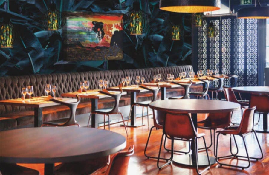
Why Vintage Poster Framing Matters

Unlike modern prints, vintage posters and maps are often made from fragile, acidic paper that deteriorates quickly if not handled correctly. Professional vintage poster framing safeguards these pieces from light, humidity, and physical stress while enhancing their visual appeal. The right approach means you’re not only displaying art but protecting history for the future.

1. Handling Fragile Paper: First Steps

The condition of the paper matters a lot before framing. Many vintage posters and maps are printed on paper that has aged, becoming brittle, yellowed, or torn at the edges. Mishandling can cause irreversible damage.

  • Handle with clean hands (or gloves). Oils, dirt, and even moisture from skin can accelerate decay or stain fragile paper.
  • Support the whole piece. Use a rigid backing when moving or laying the object flat so that weak spots don’t fold or tear.
  • Avoid adhesives that contact the paper directly. Dry mounting (gluing the paper entirely to a backing) is discouraged in conservation framing.
  • Use hinged mounting with archival tape or hinging corners, which secure the paper without adhesive over large surfaces.

2. Use Acid-Free and Archival Materials

Vintage poster framing must be as much about preservation as presentation. One of the most critical aspects is using acid-free, archival-quality materials throughout.

  • Backing boards, mat boards, mats, liners, and mountboards should be acid-free to prevent acidic migration (yellowing, brittleness).
  • Mounting adhesives or tapes: Use pH-neutral or conservation-grade adhesives that are reversible.
  • Glass or acrylic glazing that includes UV protection: UV rays fade inks and degrade paper over time.
  • If the frame uses wood mouldings or other components, ensure any liners or barriers touching the paper are acid-free.

3. UV Protective Glass or Acrylic

Exposure to light is among the biggest threats to vintage posters and maps.

  • Use glazing materials that block UV (often up to ~99%) without distorting color. Acrylic or glass labelled “UV-protected,” “museum glass,” or “conservation glass” is preferred.
  • Ensure the glazing is not placed directly against the paper—use a mat or spacer to keep a distance. Moisture or condensation between the glass and paper can cause damage.

4. Floating vs Matting Display

How you visually present the vintage poster or map is as important as how you protect it. The display style also affects how preservation materials are used.

  • Matted (with a mat board): A mat creates a gap between the artwork and the glazing, which improves airflow and prevents direct contact. Always use acid-free mat board.
  • Floating display: The artwork appears to “float” within the frame, often by being mounted on the backboard so that edges are visible. However, floating displays still demand acid-free backing, UV glazing, and careful mounting so that nothing distorts or warps.
  • Decide based on the piece’s condition, how much margin or border remains, and your preferred style.

5. Conservation & Mounting Techniques

  • Linen backing: Linen backing is a common conservation technique for very fragile posters or maps. It provides structural support while being reversible, helping prevent tears or folds.
  • Mounting with hinges: Use archival hinges to move slightly with humidity and temperature changes. Rigid or full surface adhesive mounts (dry mount) are not recommended for vintage poster framing.

6. Display, Environment, and Long-Term Care

Even with perfect framing, what happens after the piece is framed will determine its longevity.

  • Light control: Avoid direct sunlight. Prolonged exposure—even through windows—will fade inks.
  • Humidity and temperature: Keep framing in a stable environment. Too much humidity can encourage mold; too little can make paper brittle. Fluctuations are particularly damaging.
  • Hanging safely: Oversized frames need proper support (D-rings, multiple hooks) and should avoid relying solely on wire if weight becomes an issue.

7. Choosing the Right Frame Design & Aesthetic

While protection is key, presentation matters; vintage poster framing is also about complementing the art.

  • Pick a frame moulding style, finish, and material that enhances the era or theme of the poster or map—Art Deco, mid-century, or traditional.
  • The right frame makes the piece feel balanced in scale and style, drawing the eye to the artwork rather than overwhelming it.

Preserve Your Maps and Posters with Care

Preserving vintage posters or old maps takes care, the right materials, and thoughtful framing. Gentle handling, acid-free materials, UV-protective glass, and professional mounting techniques distinguish between a fading relic and a protected treasure. Displaying them correctly ensures they remain a vibrant part of your collection for years to come.

Artistic Wholesale Printing & Framing in Midvale, UT, is committed to turning vintage treasures into works you can admire and trust to last. If you have a poster or map you’d like framed, reach out to our experts. We offer custom framing, archival materials, UV glazing options, floating or matted display styles, and years of experience. Contact us today to preserve your history in style with vintage poster framing done right.

How Temperature and Humidity Affect Framed Art (and How to Protect It)

When you hang your artwork, it’s easy to focus on frames, mats, and lighting—but the invisible factors of temperature and humidity often matter most. At Artistic Wholesale Printing & Framing, we’ve seen firsthand how climate fluctuations can quietly damage paintings, photographs, and prints. The good news? With the proper knowledge and professional framing services, you can protect art from humidity and temperature swings to preserve its beauty.

Why Temperature and Moisture Matter

Art is made of delicate materials—paper, canvas, wood, textiles, and adhesives—that expand and contract with the environment. When temperatures swing dramatically or moisture builds up, these shifts stress the artwork.

  • Heat: High heat can dry out paper and canvas, leading to brittleness or cracking. It can also cause adhesives and mounting materials to loosen.
  • Cold: Excessive cold may destabilize some pigments and cause glass to fog when condensation forms.
  • Moisture: Humidity is one of the most damaging elements. Paper ripples, canvas stretches, and mold or mildew can grow behind the glass. Even metals in frames may corrode over time.

The result is gradual but permanent—faded colors, warped surfaces, and weakened structural integrity.

Risks in Commercial Spaces

Many businesses, galleries, hotels, and offices proudly display framed art, but these environments present unique challenges:

  • HVAC Cycles: Heating and cooling systems can cause constant fluctuations in temperature and humidity.
  • Sunlight Exposure: Large windows or bright lighting accelerate fading and weaken materials.
  • Crowded Displays: In restaurants or lobbies, tightly hung pieces limit airflow and trap moisture.

For commercial framing projects, stability is key. Our team at Artistic Wholesale emphasizes both environmental planning and the right materials when providing commercial picture framing and hotel art prints and framing services.

Best Practices for Art Storage and Display

Prevention is your best defense if you’re storing or displaying art for the long term. A few guidelines include:

  • Maintain Stable Climate: Aim for 70°F and around 50% relative humidity.
  • Avoid Vulnerable Spaces: Basements, attics, and garages often have extreme swings and dampness.
  • Use Spacers and Mats: Prevents condensation damage by keeping artwork off the glass.
  • Allow Airflow: Don’t pack art too closely together—air circulation prevents trapped moisture.

These small steps can prevent costly damage before it starts.

Framing Materials That Make the Difference

The right frame doesn’t just make art beautiful—it also protects it. At Artistic Wholesale Printing & Framing, we recommend:

  • UV-Resistant Glass or Acrylic: Blocks harmful rays that cause fading.
  • Acid-Free Mats: Prevents yellowing and chemical deterioration.
  • Sealed Frames: Limits moisture intrusion while allowing minimal air exchange to avoid condensation.
  • Archival-Quality Supplies: Acid-free, durable materials are essential for matboards and moldings.

Backing Boards for Extra Protection

Another critical but often overlooked layer of defense is the backing board. A rigid backing board—such as archival foam core, heritage board, or acrylic sheeting—provides structural support while helping regulate the microclimate inside the frame.

Backing boards also protect against dust, pests, and vibrations that can weaken a piece over time. Since Artistic Wholesale supplies professional matboards and other framing materials, we can recommend the right backing solutions for commercial installations and personal collections.

Everyday Steps to Protect Art from Humidity

For clients who ask how to protect art from humidity day to day, we recommend simple but effective habits:

  • Use dehumidifiers in damp climates or during wet seasons.
  • Keep framed art away from bathrooms, kitchens, or exterior walls.
  • Regularly inspect the back of frames for signs of mold or warping.
  • Rotate and dust artwork to keep it in a healthy condition.

Monitoring with Hygrometers or Data Loggers

One of the most practical steps is to monitor your environment. A small digital hygrometer—or a more advanced data logger—lets you track humidity and temperature in real time. Placing one near your framed art can alert you to harmful fluctuations before they cause permanent damage. Utah homeowners may find this especially useful during seasonal transitions, when heating or air conditioning systems create rapid shifts indoors.

Work with Utah’s Framing Experts

Your artwork deserves more than a frame—it deserves protection. At Artistic Wholesale Printing & Framing, we specialize in high-quality picture framing services in Utah that enhance and preserve your artwork. From custom commercial projects to hotel art and personal collections, our framers use archival materials and proven techniques to safeguard your pieces from temperature and humidity damage.

If you’re ready to protect your art from humidity and create a lasting display, contact us, visit our Salt Lake City area showroom, or explore our full range of framing options online. Our team will help you choose the right materials, finishes, and storage practices so your art stays vibrant and secure for years to come.

How to Choose the Right Canvas Depth for Your Painting Style

When it comes to canvas prints, the choices go beyond size and finish—canvas depth also plays a significant role in how your artwork looks once it’s on the wall. At Artistic Wholesale Printing & Framing, we’ve worked with countless artists and photographers across Utah who often ask us which canvas depth best fits their work.

The answer depends on the type of art you’re displaying, the style of your space, and the statement you want your canvas to make. Understanding canvas depth is one of the most essential starting points if you’re searching for practical painting presentation tips.

painting presentation tipsShallow vs. Gallery Wrap Depths

Canvas depth refers to the thickness of the stretcher bars that the canvas is wrapped around. Two of the most common options are:

  • Shallow Wraps (¾-inch to 1-inch depth): These canvases sit closer to the wall, creating a sleek, understated look. Shallow wraps are often easier to frame since they fit neatly into most standard picture frames. If you want your canvas print to blend in with your décor rather than dominate it, shallow depth may be the right choice.
  • Gallery Wraps (1.5-inch to 2-inch depth): Gallery wraps are thicker, creating a bold, three-dimensional presence. With the image stretched around the sides, these canvases often look complete without a frame, similar to what you’d see in a professional art gallery. A gallery wrap is ideal if you want your canvas to be a centerpiece.

How Depth Changes the Hanging Look

Depth affects more than just size—it changes how the artwork interacts with the room. A shallow canvas lies close to the wall, making it an excellent option for tight spaces, clustered gallery walls, or artwork you plan to frame. On the other hand, a gallery wrap canvas projects outward, creating shadows and depth that draw the eye. It makes a statement all on its own, which is why many artists choose it for standalone pieces.

We also offer finishing options like wire hangers, Z Bar cleat systems, or floater frames that pair beautifully with shallow and gallery-wrap canvases. The proper depth combined with the right finish gives your art the polished presentation it deserves.

Matching Canvas Depth to Art Styles

Not every style of art benefits from the same depth. Here are some helpful guidelines we share with our customers:

  • Abstract Art: Abstract pieces often feature bold colors, shapes, and textures that deserve attention. A gallery wrap canvas works best because the added depth amplifies the artwork’s impact. The thicker sides allow the design to feel immersive, and the unframed edges complement the contemporary nature of abstract art.
  • Landscape Photography or Painting: Landscapes benefit from depth, but the choice often depends on how you want them displayed. A gallery wrap enhances panoramic views and gives the scene a sense of expansiveness. However, if you’re planning to frame a landscape print for a more classic or traditional look, a shallow wrap is smarter—it fits well within a frame without overwhelming the detail.
  • Portraits: With portraits, subtlety often wins. A shallow canvas focuses on the subject’s face rather than the format of the canvas. It also allows for easy framing, which can add elegance or a personal touch. For modern family photos or casual lifestyle portraits, some clients still choose a gallery wrap for its bold, frameless look—but in most cases, shallow depth highlights the intimacy of portraiture.

Choosing Depth Based on Your Space

We always remind our clients that the correct depth isn’t only about the art—it’s also about where it will hang. For example:

  • Gallery-wrapped canvases shine in open spaces like living rooms, lobbies, or hallways, where they can stand alone and command attention.
  • Shallow-wrap canvases are better suited for clustered arrangements, stairway galleries, or smaller spaces where balance matters more than boldness.

Regardless of depth, both canvas options can be customized with mirrored, black, white, or stretched edges to achieve the exact presentation you want.

Painting Presentation Tips: Depth Matters

Canvas depth is often overlooked. Yet, choosing between shallow and gallery wraps can completely change how a piece interacts with light, space, and the viewer. Thinking about presentation at this level helps ensure your artwork feels finished and intentional.

Work with Utah’s Canvas Printing Professionals

Choosing the proper canvas depth may feel like a small detail, but it significantly impacts how your artwork is seen and remembered. At Artistic Wholesale Printing & Framing, we specialize in helping artists, photographers, and families across Utah bring their images to life through custom canvas prints. Whether you prefer a shallow wrap for a timeless framed portrait or a bold gallery wrap to showcase abstract or landscape work, we’ll ensure your piece is printed precisely and displayed beautifully.

If you’re ready to create your canvas print, contact us today, explore our canvas prints in Salt Lake City, or stop by our Midvale showroom to see samples. We’ll help you choose the depth, finish, and framing that best match your art and space, as well as expert painting presentation tips to ensure your canvas looks its best.

Metal Prints vs. Canvas Prints: Which is Best for Your Space?

Choosing the correct type of wall art can change the entire mood of a space. From warm, textured finishes to sleek, modern shine, the material you choose matters as much as the image itself. When comparing metal prints to canvas prints in Utah, it’s essential to consider durability, style, cost, and where the piece will live. Each option has unique advantages, and knowing the differences can help you decide which is best for your home or commercial space.

In this guide, Artistic Wholesale Printing compares the two options, covering durability, aesthetics, cost, and ideal use cases, so you can decide which one is the perfect fit for your space.

metal prints Utah, canvas prints UtahDurability: Which One Lasts Longer?

Metal Prints:
Metal prints are known for their exceptional durability. Created by infusing ink directly into aluminum panels, these prints are scratch-resistant, moisture-resistant, and fade-resistant. That makes them ideal for high-humidity environments like bathrooms, kitchens, or outdoor patios (under cover).

Canvas Prints:
Canvas prints, while strong, are slightly more delicate. They’re best displayed indoors in controlled environments. At Artistic Wholesale, our giclée canvas prints are printed on premium materials like 17M Satin or Production Matte Canvas, which offer longevity and color retention. However, they should be kept from moisture and direct sunlight for best results.

The Verdict:
If you need maximum durability, metal prints win. But a well-made canvas print holds up beautifully for most indoor settings over time.

Aesthetic Appeal: Texture vs. Shine

Canvas Prints:
Canvas is a classic, timeless texture that brings warmth and depth to any photo. It’s especially flattering for family portraits, landscapes, and artwork. You can choose from gallery wraps, mirrored edges, or add a floater frame to enhance the presentation. Canvas softens the image slightly, giving it a painterly feel.

Metal Prints:
Metal prints in Utah are ultra-modern and glossy. The surface adds crisp contrast and vibrancy, making them ideal for bold photography or high-definition digital art. Metal is a strong contender if you want sharp lines, luminous colors, and a clean, minimalist look.

The Verdict:
Choose canvas for texture, tradition, and softness. Choose metal for sleek, eye-catching detail and modern flair.

Display and Framing Options for Canvas and Metal Prints

While both canvas and metal prints can stand on their own, the way you finish and display them plays a significant role in how they look and feel in your space.

Canvas Prints
Canvas prints are exceptionally flexible when it comes to presentation. At Artistic Wholesale, we offer several edge styles, including black, white, mirrored, and stretched image sides. For larger pieces, hanging options include wire hangers or secure Z-bar cleats. Canvas can also be set into custom picture framing for a traditional or polished finish.

Metal Prints
Metal prints have their own display systems that create a clean, contemporary look. Depending on size and style, they can be mounted with a small wood block, a floating frame with wire hanger, sleek metal standoffs, or a Z-bar cleat system. For desks or shelves, a curved metal print offers a bold, frameless option. Metal prints can also be placed into a frame, but they are most often left unframed to showcase their modern edge.

The Verdict:
Canvas prints offer more traditional framing versatility, while metal prints lean toward frameless or floating options that emphasize sharpness and dimension. Both can be customized to match your space, whether you prefer rustic warmth or sleek minimalism.

Cost: Which Is More Budget-Friendly?

Canvas Prints:
Canvas prints in Utah are generally more affordable than metal, especially for larger sizes. At Artistic Wholesale, we offer premium satin and high-quality economy canvas options, giving clients a cost-effective way to print and display their favorite images without compromising quality.

Metal Prints:
Metal prints are more expensive due to the materials and sublimation process involved. They can be worth the investment for standout pieces or modern interiors, but if you’re working with a tighter budget—or need a large quantity—canvas is typically the better option.

The Verdict:
Canvas is the more budget-friendly choice without sacrificing impact, while metal offers a luxury feel at a higher price point.

Best Uses for Metal Prints and Canvas Prints in Utah

Canvas Prints Are Best For:

  • Home décor in living rooms, bedrooms, and hallways
  • Family portraits or wedding photos
  • Artistic and landscape photography
  • Commercial spaces with a warm, inviting vibe
  • Projects that may benefit from custom framing

Metal Prints Are Best For:

  • Kitchens, bathrooms, and high-moisture areas
  • Offices or modern commercial interiors
  • High-contrast, vibrant images (cityscapes, abstracts, product shots)
  • Clients seeking a contemporary or industrial design style
  • Outdoor covered spaces (with proper mounting)

Both canvas and metal prints can make a strong impression—it’s all about matching the material to the mood and purpose of the space.

Still Not Sure Which One’s Right? Let’s Find Your Match.

When choosing between canvas and metal prints, there’s no one-size-fits-all answer—only what fits your space, vision, and budget. At Artistic Wholesale Printing & Framing, we’ve helped clients across Utah bring their images to life in both formats. Whether you want the warmth of canvas or the brilliance of metal prints in Utah, we’ll guide you to the right choice.

Ready to get started? Contact us for canvas or metal prints in Utah, or stop by our Midvale showroom to see samples up close

Do Canvas Prints Need a Frame?

At Artistic Wholesale Printing & Framing in Utah, we’re often asked a simple question with more than one correct answer: Do canvas prints need a frame? It depends on the look you’re going for—and the space you’re decorating. While canvas prints are a popular, versatile way to display photography and artwork, the decision to frame them (or not) plays a significant role in the final presentation.

Let’s examine when framing makes sense, when it doesn’t, and the framing styles that elevate your canvas without overwhelming it.

canvas prints UtahWhen to Leave a Canvas Print Unframed

One of the reasons canvas prints are so popular is that they come ready to hang, and no extra embellishments are required. A stretched canvas wraps neatly around a wooden frame (called a stretcher bar), allowing it to stand independently without a traditional picture frame.

Unframed canvas prints are ideal when:

  • You prefer a modern or minimalist aesthetic
  • The artwork is printed with a gallery wrap (where the image extends over the edges)
  • You want to focus on the image, without visual distractions.
  • You’re creating a multi-panel canvas layout or wall collage

An unframed canvas can feel clean, professional, and intentional in open, airy spaces or contemporary interiors. However, that doesn’t mean it’s the best option for every setting.

When Canvas Prints Look Better Framed

While frameless displays work well in some spaces, others benefit from the structure and refinement that a frame can add. Framing offers visual enhancement and physical protection, especially if your print hangs in a high-traffic or more traditional space.

A canvas print may benefit from framing if:

  • It’s going in a formal room like an office, dining room, or gallery
  • You want to match existing framed artwork or décor.
  • The canvas is thinner or lacks the depth of a gallery wrap
  • You’re aiming for a polished, upscale presentation.

Frames provide a sense of boundary and can help your artwork feel finished. They also prevent edges from warping or getting nicked over time, making them a wise choice for preserving your piece long-term.

Custom Picture Framing in Utah for Canvas Prints

If you decide to frame your canvas, you’re not limited to one style. At Artistic Wholesale Printing & Framing, we offer a wide selection of custom picture framing in Utah to suit classic and contemporary tastes. Some of the most popular framing options for canvas include:

Floating Frames

These frames create a small gap between the canvas and the inner edge of the frame, giving the illusion that the artwork is “floating” inside. This option maintains the clean look of a gallery wrap while adding definition and visual interest.

Best for: Modern homes, gallery-style displays, or oversized canvases.

Traditional Frames (with or without glass)

Some clients prefer the look of a classic wood or metal frame surrounding the canvas. While glass is typically avoided for stretched canvas (to prevent glare and allow the texture to show), it may be beneficial in some cases, especially for prints on board or thin canvas.

Best for: Traditional interiors, heritage art, or matched framing with other pieces.

Deep Shadow Box Frames

If your canvas is extra thick or includes dimensional texture, a shadow box-style frame provides depth and drama. It also helps protect textured or mixed media surfaces from dust and damage.

Best for: Abstract art, textured canvas, or layered pieces.

Each frame type can be customized in material, color, width, and finish. The right frame adds intention and harmony to your display, whether you want something subtle or bold.

Canvas Prints for Every Style and Space

Utah’s homes and businesses are as varied as the surrounding landscapes—from mountain cabins and modern lofts to creative commercial spaces. That’s why canvas prints remain a go-to choice for Utah designers and homeowners alike. They’re lightweight, versatile, and easy to scale for any wall.

In commercial settings like offices, galleries, or hotels, framed canvas prints add a sense of refinement and cohesion, perfect for creating a memorable, professional atmosphere.

Framing your canvas gives you an additional level of creative control. You can blend your art with surrounding decor, introduce contrast, or create cohesion across a gallery wall. It also makes your print feel more permanent and protected—an especially smart move if you invest in large-format prints or custom commissions.

To Frame or Not to Frame? Let’s Make It Easy

Framing a canvas print is ultimately a personal choice, but it should align with your space, style, and goals. At Artistic Wholesale Printing & Framing, we help clients across Utah find the perfect balance between form and function. Whether you want a sleek floating frame, a bold classic edge, or a modern frameless look, we’ll walk you through the best options.

Ready to elevate your canvas? Explore professional custom picture framing in Utah with Artistic Wholesale. Contact us today or stop by our Midvale showroom to browse frame styles, see samples, and bring your vision to life.